
Color 101
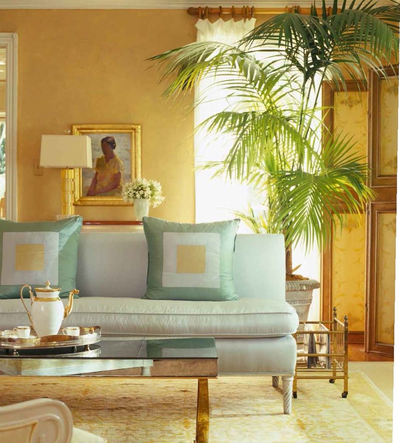
There isn't anything more important in art or interior design than color---nothing else can create a mood or a feeling as much as color, or the lack of color.
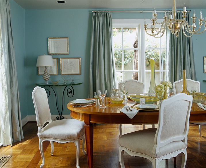
This is an almost square dining room painted in HC-143 Wythe Blue by Benjamin Moore. While it is the cool color of the deep blue sea, it has a warmth that makes the room feel cozy, especially with a round dining table.
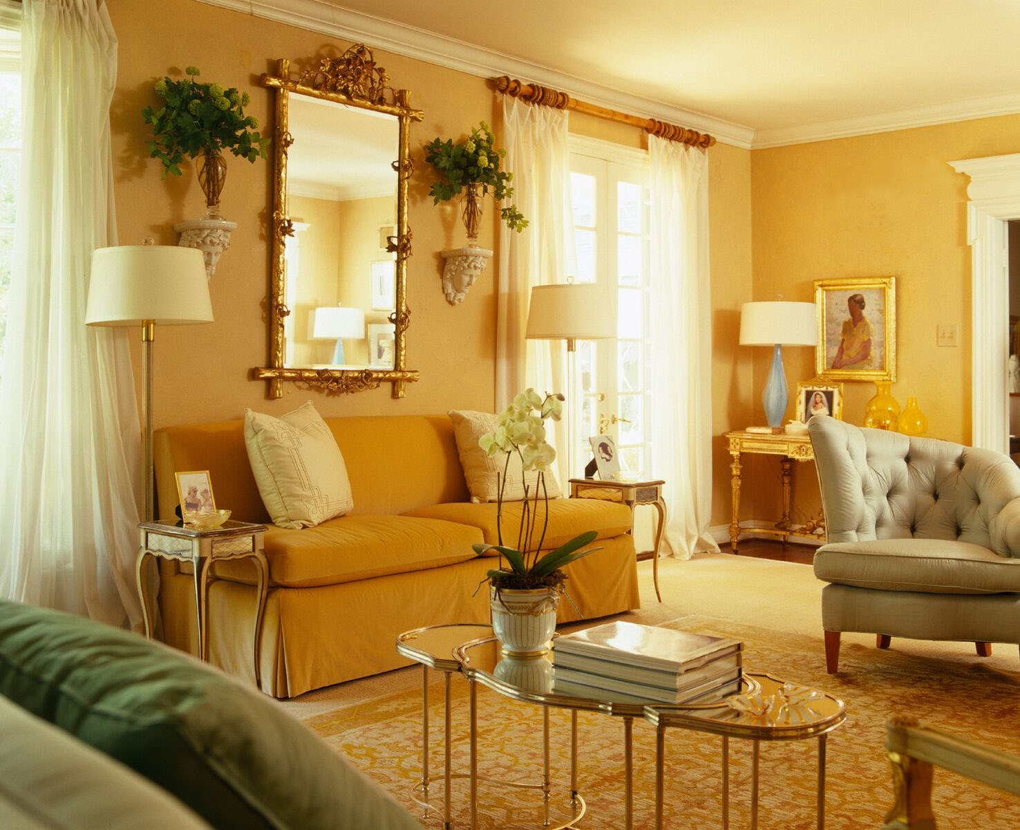
Yellow gold is one of my favorite colors when I want to create a sunny mood. My living room has been this color for more years than I want to say! It is Donald Kaufman DKC-20. I never come into this room and not have my spirits lifted---even walking by it makes me smile.
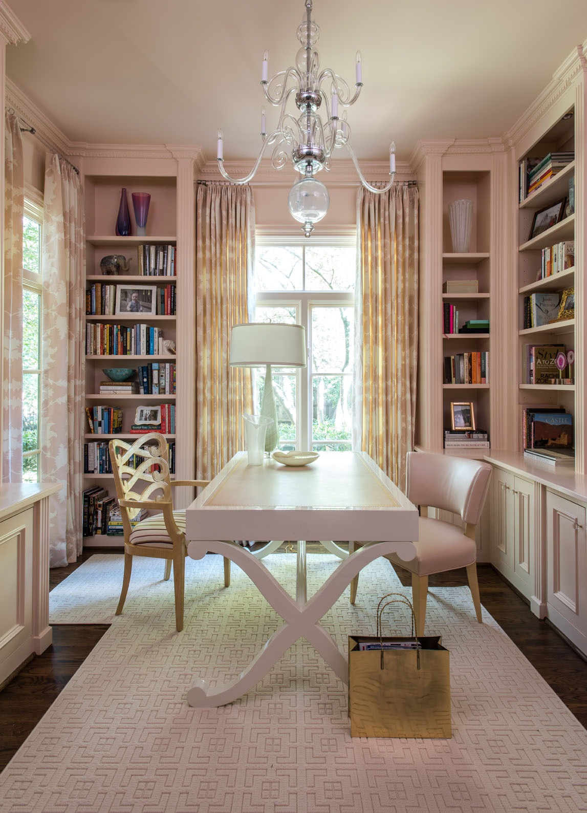
Blush, not pink, is a wonderful way to create a sophisticated, soft look---surprisingly, many of our male clients like it, especially for bedrooms if paired with more masculine furnishings. I especially like HC-60 Queen Anne Pink by Benjamin Moore.
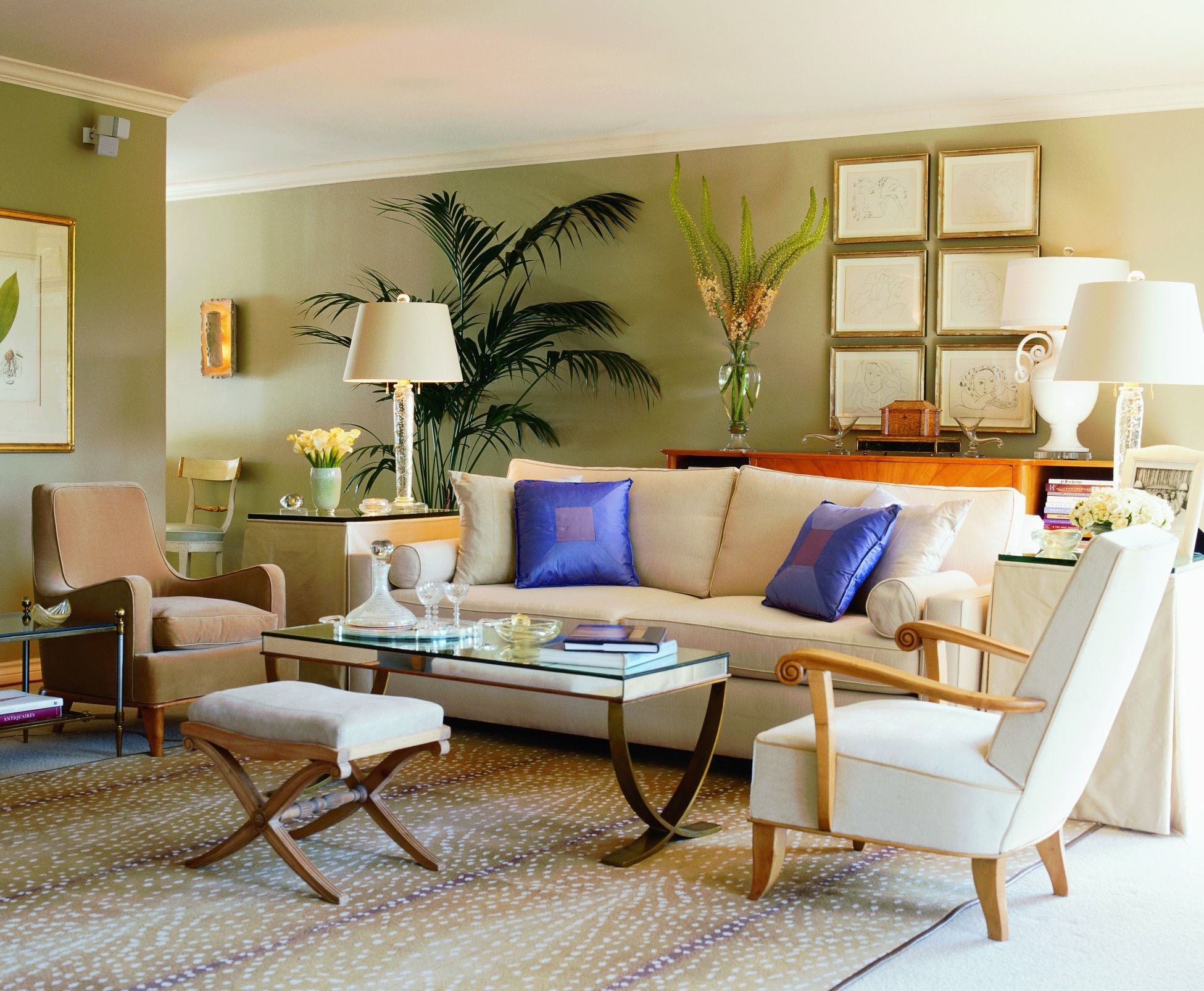
I consider green to be a neutral since it is a predominant color in nature. And because being outdoors can be so relaxing, green is a soothing color and one I particularly like using in warm climates---especially when we want to bring the landscape indoors. This room is painted in Donald Kaufman DK-25.
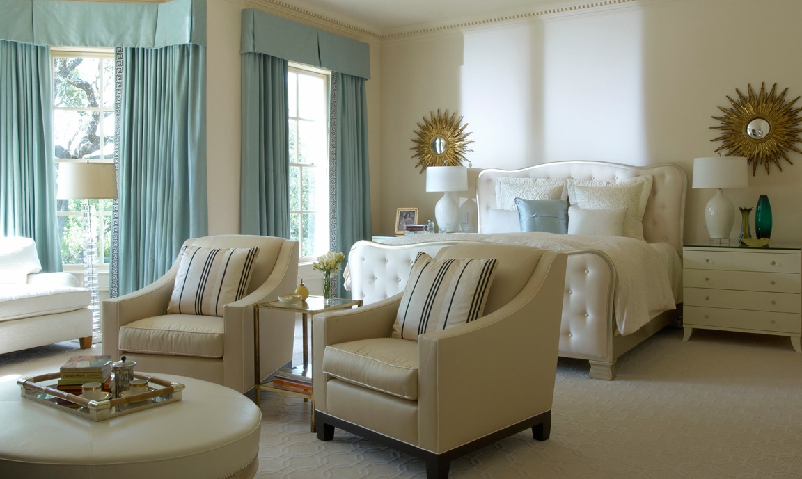
Yes, ivory is a color! This creamy bedroom with accents of a French blue green makes for a romantic and relaxed setting---what we all want at the end of a busy and hectic day. I particularly like OC-84 Creme Caramel by Benjamin Moore when using ivory.
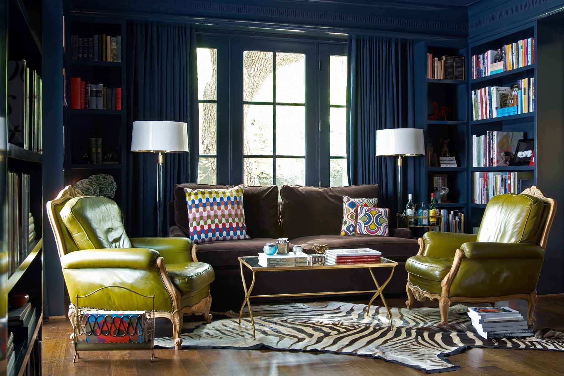
Navy or any dark color can make a small room appear larger as the corners recede. There are many great navies---this room is painted in HC- 154 Hale Navy by Benjamin Moore. I love the way it looks with the acid green leather chairs---one of my all time favorite rooms!
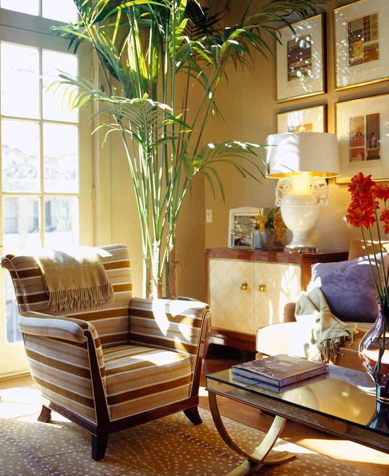
When I want to make a room feel warm and cozy, I always think of HC-44 Lennox Tan by Benjamin Moore. This particular room has very high ceilings and the warmth of this color offset that vastness. You feel as though you have a vicuna or camel coat wrapped around you in a room of this color.
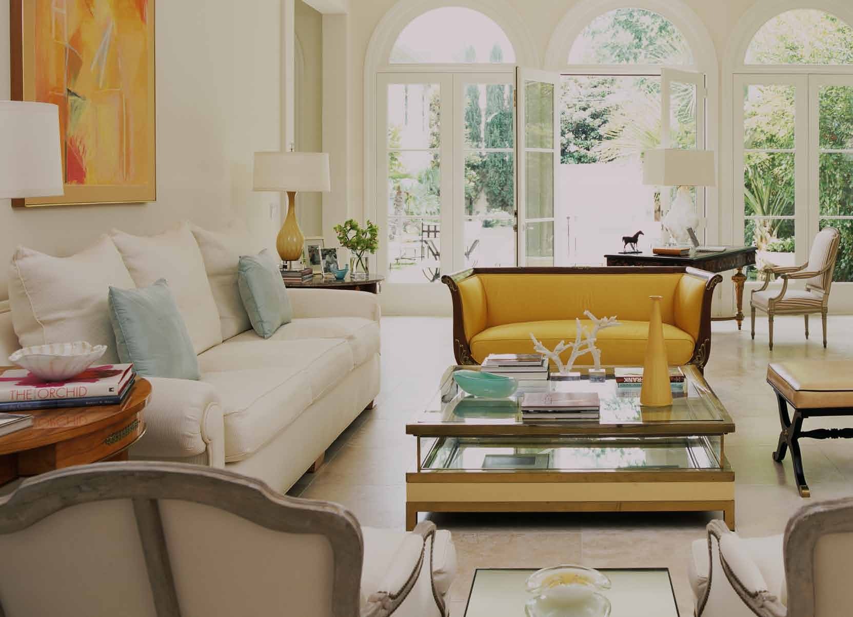
A (barely) off white is always great to create a light and airy space. This room was inspired by those on the Cote d’azur. One of my favorite whites is OC-17 White Dove by Benjamin Moore. Note how the yellows in this room just pop!
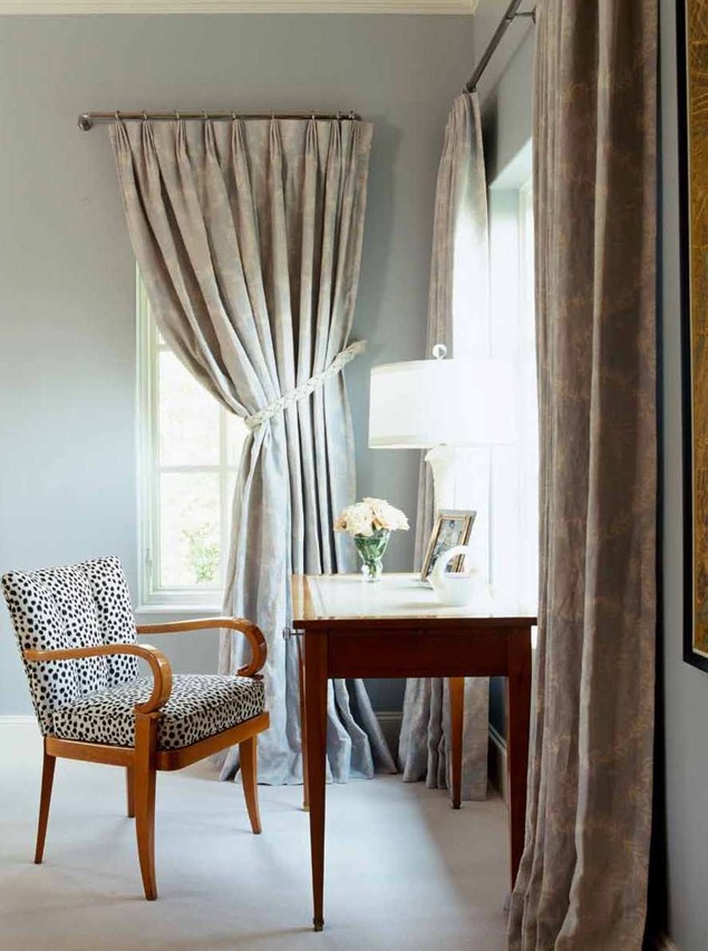
I love a wonderful French blue---one of my all time favorites is DKC-33 by Donald Kaufman. It is such a great neutral blue and works with any color you put with it. We used it in a house in Colorado because it is one of those rare blues that has warm undertones.
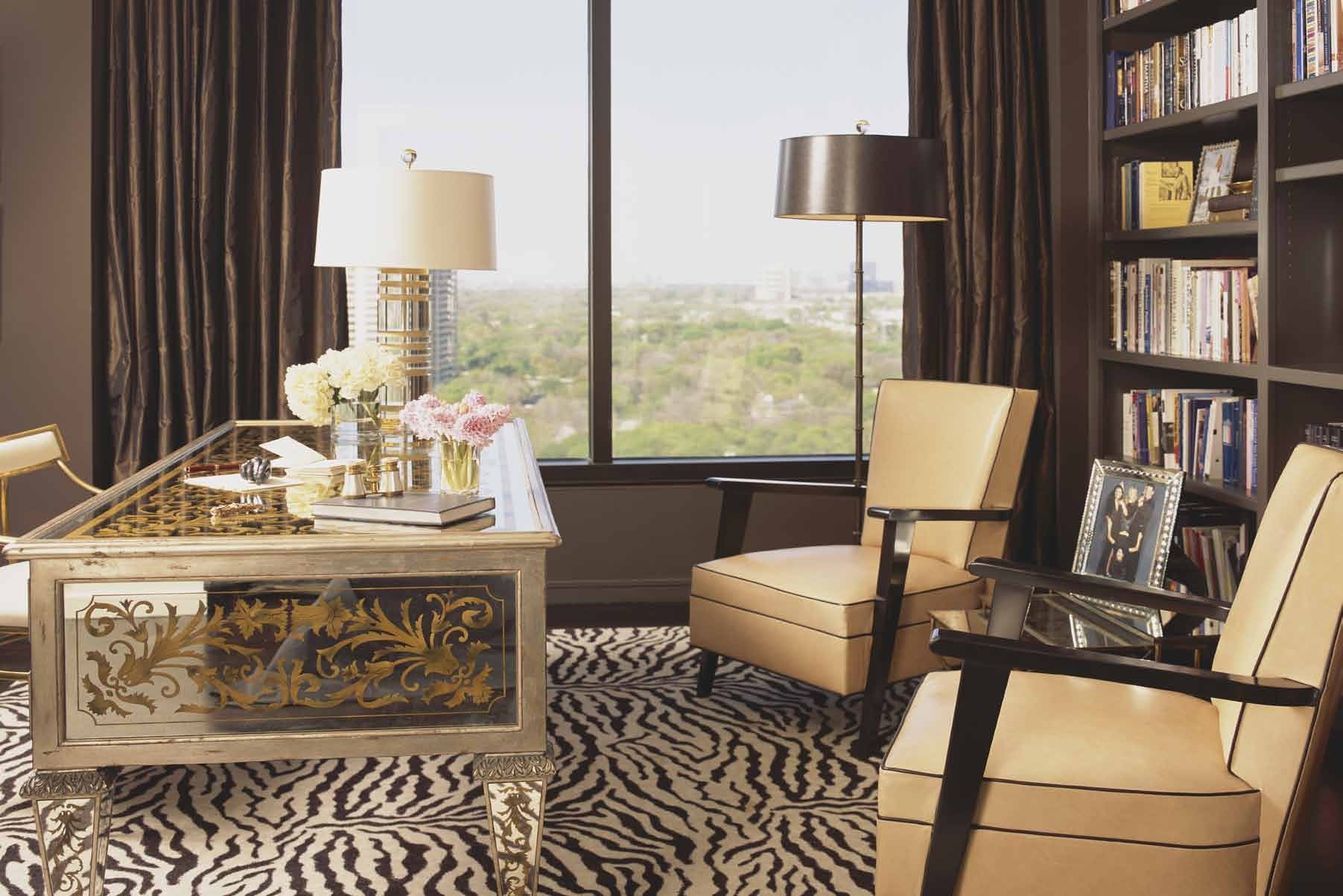
Chocolate brown is another darker color that is simply classic. I particularly like 2112-10 Mink by Benjamin Moore’s. It’s a rich, dark bittersweet that will always make everything look more luxurious and glamorous.
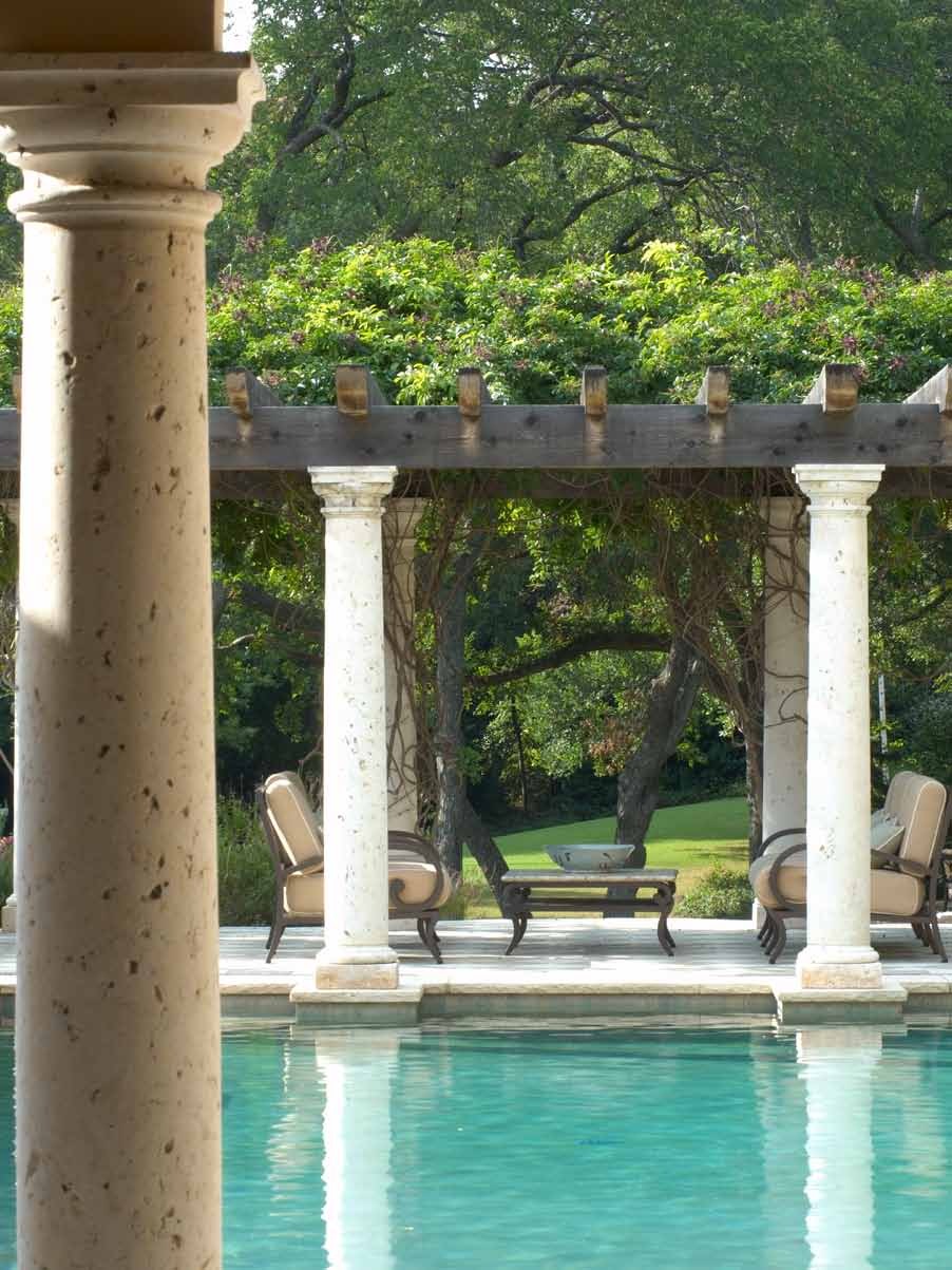
The great outdoors! The true inspiration for all colors—all you have to do is look at nature to know how to use color. I know that sounds simplistic, but it’s true.
Color has influenced every aspect of my life---fashion, interiors, and certainly nature---I love being near water but also appreciate the mountains. There are many “no-nos” when it comes to color---that will be for another Notebook!


